Content Manager APIs
Page summary:
Content Manager APIs add panels, actions, and custom rich text blocks to the Content Manager through
addEditViewSidePanel,addDocumentAction,addDocumentHeaderAction,addBulkAction, oraddRichTextBlocks. Each API accepts component functions with typed contexts, enabling precise control over document-aware UI injections.
Content Manager APIs are part of the Admin Panel API. They are a way for Strapi plugins to add content or options to the Content Manager. The Content Manager APIs allow you to extend the Content Manager by adding functionality from your own plugin, just like you can do it with Injection zones.
Before diving deeper into the concepts on this page, please ensure you have:
- created a Strapi plugin,
- read and understood the basics of the Admin Panel API
General information
Strapi 5 provides 4 Content Manager APIs, all accessible through app.getPlugin('content-manager').apis.
All the Content Manager APIs share the same API shape and must use components.
Injection zones vs. Content Manager APIs
For adding panels, actions, or buttons to the Content Manager, the Content Manager APIs (addDocumentAction, addEditViewSidePanel, etc.) are often more robust and better typed than injection zones. Use injection zones when you need to insert components into specific UI areas not covered by the Content Manager APIs.
Content Manager APIs and injection zones are both extension points to customize the admin panel, but they solve different needs:
| Need | Recommended API | Why |
|---|---|---|
| Add a custom panel in the Edit View side area | Content Manager API (addEditViewSidePanel) | Best for contextual information or controls that stay visible while editing. |
| Add actions in a document action menu | Content Manager API (addDocumentAction) | Best for document-level actions in the Edit View actions menu. |
| Add actions in the Edit View header | Content Manager API (addDocumentHeaderAction) | Best for quick, prominent actions next to the document title. |
| Add actions for selected entries in List View | Content Manager API (addBulkAction) | Best for workflows that apply to multiple entries at once. |
| Add UI to a predefined zone in a plugin view (localized visual customization) | Injection Zones API (injectComponent) | Best when you target a specific zone exposed by a plugin. |
For implementation details and up-to-date API signatures, please refer to the content-manager file in the Strapi codebase.
API shape
All Content Manager APIs works in the same way: to use them, call them on your plugin's bootstrap() function, in 2 possible ways:
When using TypeScript, the apis property returned by app.getPlugin() is typed as unknown. Cast it to ContentManagerPlugin['config']['apis'] before calling the APIs.
-
Passing an array with what you want to add. For example, the following code would add the ReleasesPanel at the end of the current EditViewSidePanels:
- JavaScript
- TypeScript
const apis = app.getPlugin('content-manager').apis;

apis.addEditViewSidePanel([ReleasesPanel]);
import type { ContentManagerPlugin } from '@strapi/content-manager/strapi-admin';
const apis =
app.getPlugin('content-manager').apis as ContentManagerPlugin['config']['apis'];
apis.addEditViewSidePanel([ReleasesPanel]); -
Passing a function that receives the current elements and return the new ones. This is useful if, for example, you want to add something in a specific position in the list, like in the following code:
- JavaScript
- TypeScript
const apis = app.getPlugin('content-manager').apis;

apis.addEditViewSidePanel((panels) => [SuperImportantPanel, ...panels]);
const apis =
app.getPlugin('content-manager').apis as ContentManagerPlugin['config']['apis'];
apis.addEditViewSidePanel((panels) => [SuperImportantPanel, ...panels]);
Components
You need to pass components to the API in order to add things to the Content Manager.
Components are functions that receive some properties and return an object with some shape (depending on the function). Each component's return object is different based on the function you're using, but they receive similar properties, depending on whether you use a ListView or EditView API.
Properties include important information about the document(s) you are viewing or editing.
ListViewContext
interface ListViewContext {
  /**
   * Will be either 'single-types' | 'collection-types'
   */
  collectionType: string;
  /**
   * The current selected documents in the table
   */
  documents: Document[];
  /**
   * The current content-type's model.
   */
  model: string;
}
EditViewContext
interface EditViewContext {
  /**
   * This will only be null if the content-type
   * does not have draft & publish enabled.
   */
  activeTab: 'draft' | 'published' | null;
  /**
   * Will be either 'single-types' | 'collection-types'
   */
  collectionType: string;
  /**
   * Will be undefined if someone is creating an entry.
   */
  document?: Document;
  /**
   * Will be undefined if someone is creating an entry.
   */
  documentId?: string;
  /**
   * Will be undefined if someone is creating an entry.
   */
  meta?: DocumentMetadata;
  /**
   * The current content-type's model.
   */
  model: string;
}
More information about types and APIs can be found in Strapi's codebase, in the `/admin/src/content-manager.ts` file.
Example:
Adding a panel to the sidebar can be done as follows:
- JavaScript
- TypeScript
const Panel = ({
  activeTab,
  collectionType,
  document,
  documentId,
  meta,
  model
}) => {
  return {
    title: 'My Panel',
    content: <p>I'm on {activeTab}</p>
  }
}
import type { PanelComponent, PanelComponentProps } from '@strapi/content-manager/strapi-admin';

const Panel: PanelComponent = ({
  activeTab,
  collectionType,
  document,
  documentId,
  meta,
  model
}: PanelComponentProps) => {
  return {
    title: 'My Panel',
    content: <p>I'm on {activeTab}</p>
  }
}
Available APIs
addEditViewSidePanel
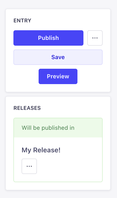
Use this to add new panels to the Edit view sidebar, just like in the following example where something is added to the Releases panel:
addEditViewSidePanel(panels: DescriptionReducer<PanelComponent> | PanelComponent[])
PanelComponent
A PanelComponent receives the properties listed in EditViewContext and returns an object with the following shape:
type PanelComponent = (props: PanelComponentProps) => {
  title: string;
  content: React.ReactNode;
};
PanelComponentProps extends the EditViewContext.
addDocumentAction
Use this API to add more actions to the Edit view or the List View of the Content Manager. There are 3 positions available:
-
headerof the Edit view: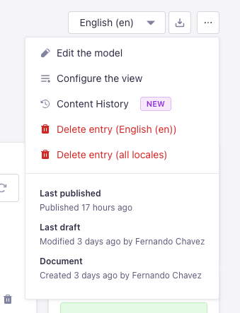
-
panelof the Edit view: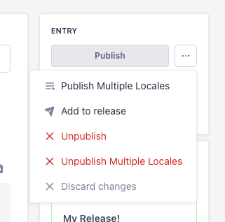
-
table-rowof the List view: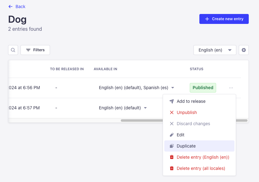
addDocumentAction(actions: DescriptionReducer<DocumentActionComponent> | DocumentActionComponent[])
DocumentActionDescription
The interface and properties of the API look like the following:
interface DocumentActionDescription {
    label: string;
    onClick?: (event: React.SyntheticEvent) => Promise<boolean | void> | boolean | void;
    icon?: React.ReactNode;
    /**
     * @default false
     */
    disabled?: boolean;
    /**
     * @default 'panel'
     * @description Where the action should be rendered.
     */
    position?: DocumentActionPosition | DocumentActionPosition[];
    dialog?: DialogOptions | NotificationOptions | ModalOptions;
    /**
     * @default 'secondary'
     */
    variant?: ButtonProps['variant'];
    loading?: ButtonProps['loading'];
}

type DocumentActionPosition = 'panel' | 'header' | 'table-row' | 'preview' | 'relation-modal';

interface DialogOptions {
    type: 'dialog';
    title: string;
    content?: React.ReactNode;
    variant?: ButtonProps['variant'];
    onConfirm?: () => void | Promise<void>;
    onCancel?: () => void | Promise<void>;
}
interface NotificationOptions {
    type: 'notification';
    title: string;
    link?: {
        label: string;
        url: string;
        target?: string;
    };
    content?: string;
    onClose?: () => void;
    status?: NotificationConfig['type'];
    timeout?: number;
}
interface ModalOptions {
    type: 'modal';
    title: string;
    content: React.ComponentType<{
        onClose: () => void;
    }> | React.ReactNode;
    footer?: React.ComponentType<{
        onClose: () => void;
    }> | React.ReactNode;
    onClose?: () => void;
}
addDocumentHeaderAction
Use this API to add more actions to the header of the Edit view of the Content Manager:

addDocumentHeaderAction(actions: DescriptionReducer<HeaderActionComponent> | HeaderActionComponent[])
HeaderActionDescription
The interface and properties of the API look like the following:
interface HeaderActionDescription {
  disabled?: boolean;
  label: string;
  icon?: React.ReactNode;
  type?: 'icon' | 'default';
  onClick?: (event: React.SyntheticEvent) => Promise<boolean | void> | boolean | void;
  dialog?: DialogOptions;
  options?: Array<{
    disabled?: boolean;
    label: string;
    startIcon?: React.ReactNode;
    textValue?: string;
    value: string;
  }>;
  onSelect?: (value: string) => void;
  value?: string;
}

interface DialogOptions {
  type: 'dialog';
  title: string;
  content?: React.ReactNode;
  footer?: React.ReactNode;
}
addBulkAction
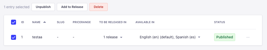
Use this API to add buttons that show up when entries are selected on the List View of the Content Manager, just like the "Add to Release" button for instance:
addBulkAction(actions: DescriptionReducer<BulkActionComponent> | BulkActionComponent[])
BulkActionDescription
The interface and properties of the API look like the following:
interface BulkActionDescription {
  dialog?: DialogOptions | NotificationOptions | ModalOptions;
  disabled?: boolean;
  icon?: React.ReactNode;
  label: string;
  onClick?: (event: React.SyntheticEvent) => void;
  /**
   * @default 'default'
   */
  type?: 'icon' | 'default';
  /**
   * @default 'secondary'
   */
  variant?: ButtonProps['variant'];
}
addRichTextBlocks
Use this API to register custom block types in the Blocks rich text field. Custom blocks appear in the toolbar dropdown alongside built-in ones.
addRichTextBlocks must be called in the register() lifecycle function, not bootstrap(). The editor initializes its Slate instance during register, so blocks must be available at that point.
addRichTextBlocks(blocks: RichTextBlocksStore | ((currentBlocks: RichTextBlocksStore) => RichTextBlocksStore))
The API accepts 2 call signatures:
-
Passing an object: the provided blocks are merged into the existing blocks store.
- JavaScript
- TypeScript
src/admin/app.jsexport default {
register(app) {
app.getPlugin('content-manager').apis.addRichTextBlocks({
callout: {
renderElement: (props) => <Callout {...props.attributes}>{props.children}</Callout>,
icon: Information,
label: { id: 'my-plugin.blocks.callout', defaultMessage: 'Callout' },
matchNode: (node) => node.type === 'callout',
isInBlocksSelector: true,
handleConvert(editor) { /* use Slate Transforms to set node type */ },
snippets: [':::callout'],
},
});
},
};src/admin/app.tsimport type { ContentManagerPlugin } from '@strapi/content-manager/strapi-admin';
export default {
register(app) {
const apis =
app.getPlugin('content-manager').apis as ContentManagerPlugin['config']['apis'];
apis.addRichTextBlocks({
callout: {
renderElement: (props) => <Callout {...props.attributes}>{props.children}</Callout>,
icon: Information,
label: { id: 'my-plugin.blocks.callout', defaultMessage: 'Callout' },
matchNode: (node) => node.type === 'callout',
isInBlocksSelector: true,
handleConvert(editor) { /* use Slate Transforms to set node type */ },
snippets: [':::callout'],
},
});
},
}; -
Passing a function: the function receives the current blocks store and must return the updated store. Use this form to remove or replace built-in blocks.
- JavaScript
- TypeScript
src/admin/app.jsexport default {
register(app) {
app.getPlugin('content-manager').apis.addRichTextBlocks((currentBlocks) => {
// Remove the built-in code block
const { code: _removed, ...rest } = currentBlocks;
return rest;
});
},
};src/admin/app.tsimport type {
ContentManagerPlugin,
RichTextBlocksStore,
} from '@strapi/content-manager/strapi-admin';
export default {
register(app) {
const apis =
app.getPlugin('content-manager').apis as ContentManagerPlugin['config']['apis'];
apis.addRichTextBlocks((currentBlocks: RichTextBlocksStore) => {
const { code: _removed, ...rest } = currentBlocks;
return rest;
});
},
};
Block definition
Each entry in the blocks object is a block definition with the following properties:
| Property | Required | Description |
|---|---|---|
renderElement | Yes | React render function. Spread props.attributes on the root element and render props.children. |
matchNode | Yes | Returns true if a given Slate node belongs to this block type. |
isInBlocksSelector | No | Set to true to show the block in the toolbar dropdown. Defaults to false. |
icon | No | Icon component shown in the toolbar dropdown. Required when isInBlocksSelector is true. |
label | No | MessageDescriptor ({ id, defaultMessage }) shown in the toolbar dropdown. Required when isInBlocksSelector is true. |
handleConvert | No | Called when the user selects this block from the dropdown. Use Slate's Transforms to set the node type. |
handleEnterKey | No | Custom Enter key behavior inside this block. |
handleBackspaceKey | No | Custom Backspace key behavior. |
handleTab | No | Custom Tab key behavior (e.g., indentation). |
handleShiftTab | No | Custom Shift+Tab key behavior. |
snippets | No | Typing one of these strings followed by Space triggers a conversion to this block type. |
dragHandleTopMargin | No | Adjusts the vertical position of the drag-to-reorder grip icon. |
plugin | No | A Slate plugin registered when the editor instance is created. Use this for custom normalizers or Slate-level behavior. |
isDraggable | No | Function returning whether a given element is draggable. Defaults to () => true. |
The built-in block keys are: paragraph, heading-one, heading-two, heading-three, heading-four, heading-five, heading-six, list-ordered, list-unordered, image, quote, code, link, list-item.
More information about types can be found in Strapi's codebase, in the BlocksEditor.tsx file.